Modernism
Rejection of
ornament (Adolf Loos, 1908) ornament and crime.
- This is were everything is stripped
back and less is more. This was adapted by
Ludwig Mies van der Rohe who was a famous architect and designed on a
minimalist design.
Form follows
function. (Louis Silivan 1896) The tall office building artistically
considered)
-
This
is where the function should come before the form. This means that the first
role in whatever is made should be made to function well before making it stand
it. It should communicate the intended
purpose.
International
typographic style
-
Switzerland
post World War 2.
-
Grid
-
Flush
Left, ragged right text
-
Abandoning
of drawn illustrations in favour of photography.
Aksidenz
Grotesk
-
Simple
-
No
decorative serifs
-
Nothing
unnecessary
Universal
Typeface by Herbert Baye
Le Cabuser
‘Plan Voisin’ 1927.
-
Remove
equality
-
Human
and personal element
During the
seminar we watched various videos but one that caught my eye was Wim Crouwel
talking about Helvetica. Wim Crouwel says everything needs to be neutral. ‘It
should be clear, it should be readable, it should be straightforward.’
Modernism is about order. Wim Crouwel uses the grid to create this order.
In the same
documentary ‘Helvetica’ Massimo Vignelli says that typography is really white
and that it isn’t even black. It is the
spacing between the black that makes it typography.
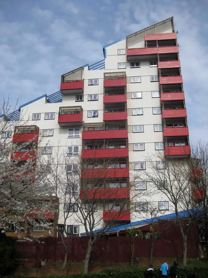
An example of
modernism is the Byker Housing project. This is a building made in Newcastle and was
one of the first project to unite community with architecture. The building looks very organised and follows
a grid format. The building was used to
get rid of people living in poverty and to enhance structure.
Postmodernism
-
Rejection of International Swiss Style
-
Pessimism
-
Exhaustion
-
Pluralism
-
Reaction to modern life, technology, new materials and
Communication
It is equivalent to late capitalism and an artistic
and stylistic eclecticism.
According to Charles Jencks on July 15th
1972 at 3:32pm modernism died. This is
due to an image of the Pruitt-Igoe housing development which lasted less than
20 years after they were destroyed. The building was created to bring families
together and ironically created anger and fear.
 Postmodernism was a period during the 1980’s and 90’s
taking what modernism believed in and going against it. It was chaos and
rupture to modernism. Postmodernism was a period were artists went crazy and
would reject modernist beliefs.
Postmodernism was a period during the 1980’s and 90’s
taking what modernism believed in and going against it. It was chaos and
rupture to modernism. Postmodernism was a period were artists went crazy and
would reject modernist beliefs.
After researching about modernism I looked at
one artist in particular, Ed Fella. His
artwork consisted of letters going over one another even to the point where it
is not readable. It consisted of random colours causing chaos and confusion.
 Another artist I looked at was Paula Scher who hated
Helvetica. She is an artist who wanted to create chaos against Helvetica. Paula
created one poster that instantly caught my eye and indeed went viral when it
was made in 1995. It was called ‘The Public – Da Funk’ which consisted of words
being varied in size, colour and angle. Paula wanted to created something that
had a life of its own and was witty.
Another artist I looked at was Paula Scher who hated
Helvetica. She is an artist who wanted to create chaos against Helvetica. Paula
created one poster that instantly caught my eye and indeed went viral when it
was made in 1995. It was called ‘The Public – Da Funk’ which consisted of words
being varied in size, colour and angle. Paula wanted to created something that
had a life of its own and was witty.
David Carson - 'Don’t mistake legibility for
communication.'
No comments:
Post a Comment